
To fix one screen, I built two other apps first
10–16 August in Forma: to work on the interface with AI we ended up building two helper apps — a muscle-overlay lab and a backend-less playground — and with them the training cards went from a generic silhouette to a body with the day's muscles lit up.
What we set out to do
Last week I summed it up like this: the app stopped inventing numbers. This week was the next step, which turns out to be harder than it sounds: making the drawing tell the truth too.
Three fronts. First, the "Today's training" card, which had been showing the same grey silhouette every single day since the redesign — leg day, pull day, run day, rest day, all identical — while the backend knew perfectly well which muscles each session worked. Second, the buttons: the app had been quietly accumulating different ways to draw the same control, and it was time to sort that out. And third, a small one that ended up shaping everything else: how do you test the app on a laptop where you can't run the backend?
What wasn't in the plan was how it ended up getting solved. To be able to work on that screen — to see what was happening, iterate with the AI and check the result — we first had to build two applications that are not the application: a muscle-overlay lab, and a playground mode that brings Forma up already signed in with no backend at all. Neither of them ships. Both are committed. And without them, this week wouldn't have happened.
Zero database migrations, incidentally. All of it happened in the frontend.
The problems we ran into
The Wednesday that announced chest and triceps
The bug that opens the week was spotted by the user on an ordinary Wednesday. The plan said "Run · Intervals", and the TODAY'S TRAINING card cheerfully announced a focus of "Chest, Shoulders, Triceps". Which is a strength day. Next to it: "4 / 6 exercises" and "55 min".
It wasn't a calculation error. They were constants: a PLACEHOLDER object with
a fixed duration, a fixed focus and a fixed exercise count, living inside the
same card as real plan data. The screen was contradicting itself, and doing it
with the confidence of someone reciting from memory.
It's exactly the same animal we hunted last week in nutrition, just wearing a different costume: there it was filler figures, here it was a filler description. And all the while, the good data existed. The endpoint that returns a session's muscle map has been in production since July. Its only output on screen was that one comma-separated line: "Focus: Quads, Glutes, Hamstrings…". Anatomical information served as a shopping list.
Thirty-five CSS files drawing their own button
The second front started with the user looking at screenshots: "I think we need
to standardise the buttons". We measured before touching anything, and the
number was worse than it sounded: there was a Button component with five
variants and, in parallel, thirty-five CSS modules drawing buttons by hand.
Ninety hand-styled elements across forty files. Six different sizes for the same
control. And three different accessibility semantics for the same tab.
Lifting that rug is where the genuinely serious thing turned up, and it wasn't cosmetic.
The --color-accent-strong token — the green the app uses for text: links,
the active menu item, glyphs — sat at a value whose contrast against the
background was 2.77:1. The WCAG minimum for normal text is 4.5:1. It didn't
even clear the 3:1 bar for large text. It had been there for weeks.
And three forms (log meal, water, plan ready) referenced two CSS variables that don't exist in the theme. When that happens the rule falls through to its fallback, and the fallback someone had written was a blue. So in an app whose colour is green, the selected option in the meal form rendered blue. Nobody had reported it.
No Docker, no backend, no app
Then the logistical problem, which the user put plainly: "this machine has no
Docker and I can't bring up the backend; with npm run dev all I can see is the
landing page, because there's no database. How do I test the app as if I were
signed in?"
That isn't a configuration problem, it's an architectural one: Forma's authentication lives on the server. The frontend's session context asks the backend who you are, and a 401 means anonymous. Without a backend, the app has no way to believe a session exists. You can look at the landing page and that's about it.
And the iPad, which never fits
The last problem is the silliest and cost the most iterations. Once the silhouettes were in, the card fit fine on desktop and fine on mobile, and on iPad it came out enormous: laid out as a single row, it ate half the screen before you reached the buttons.
How we solved it
Lighting up the body
The fix for the first one was to throw away the PLACEHOLDER, derive the focus
from the real muscle map, and then use that same map for what actually mattered:
lighting the muscles up on a silhouette.
The user brought four anatomical plates (male and female, front and back views) plus custom figures for running and rest days. From there, every session draws its own body.
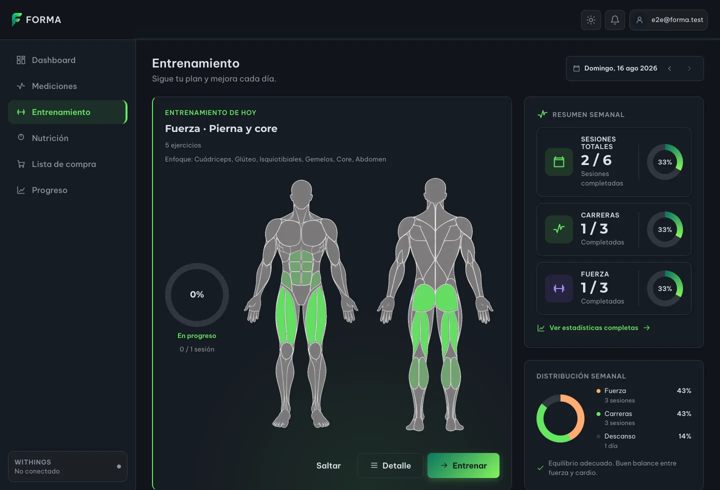
Both views are always shown, not just the one matching the session. That was deliberate: a workout's muscles don't respect that split. A pull day works lats and triceps at the back and biceps at the front. Showing one side would hide half of what you're training.
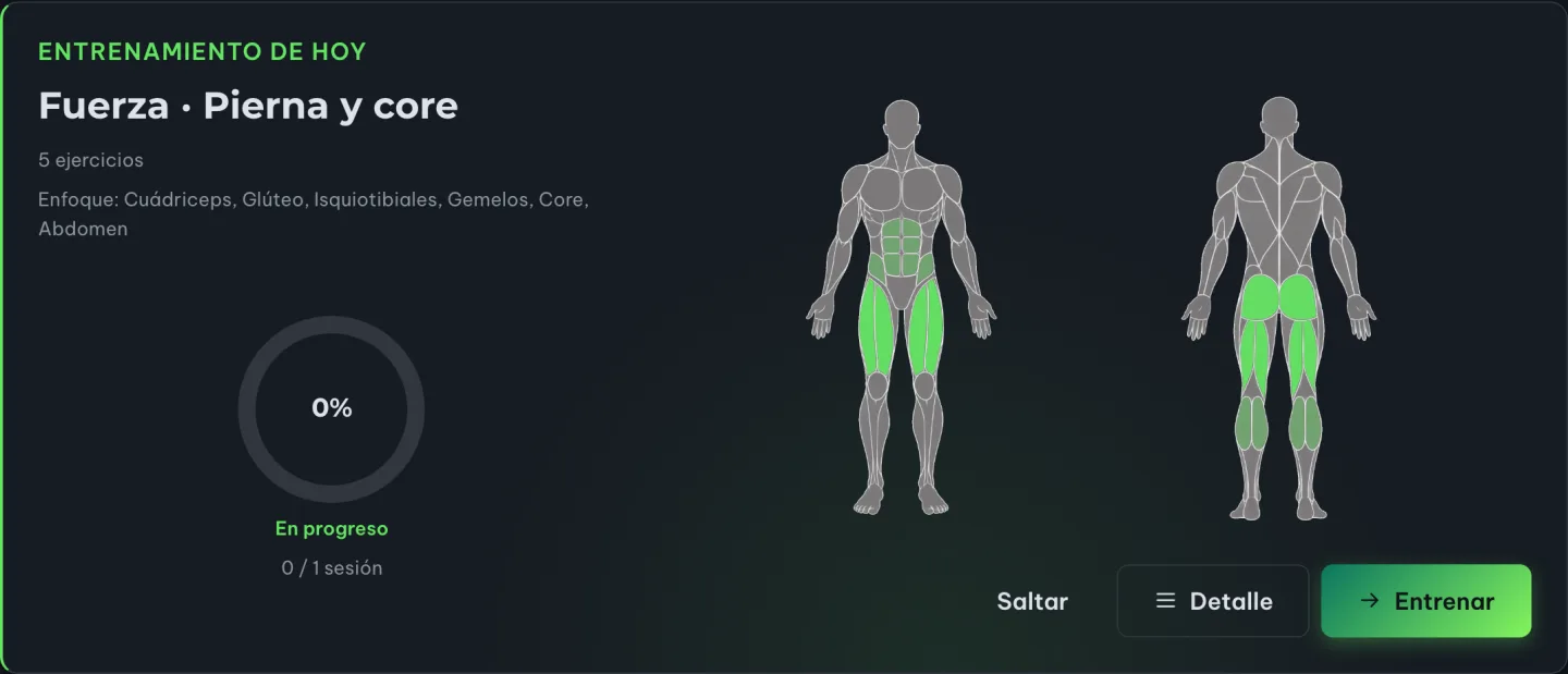
On iPad the card ended up in two columns: header, title, exercises and focus on the left with the ring underneath; the two silhouettes on the right, filling the space that used to stretch downward.
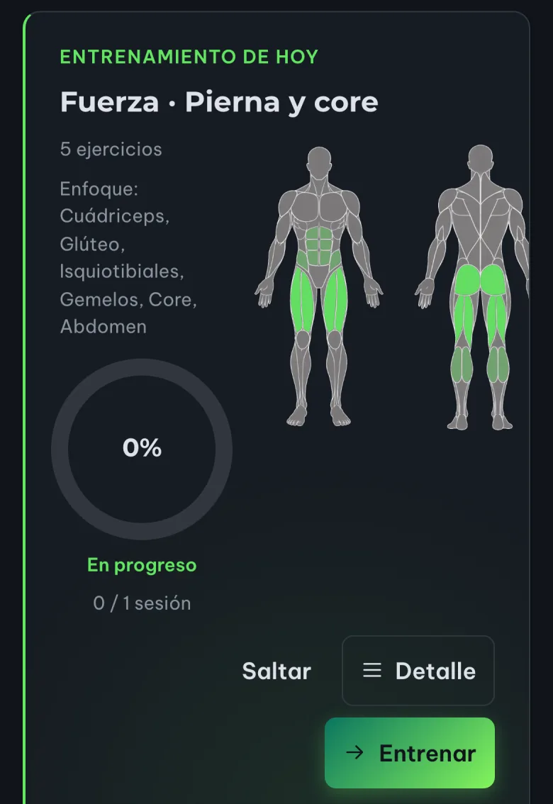
And on mobile the same card recomposes itself: the text narrows, the silhouettes stay to the right and the buttons drop below. The button labels were shortened for exactly this ("Entrenar" instead of "Ver entrenamiento", "Detalle" instead of "Ver detalle").
Mask, not image
Here's the one properly technical stretch of the post, because it's what makes everything above work.
The obvious temptation is to paint each muscle as an image. Drop an <img> of
the quadriceps on top of the silhouette and call it done. It doesn't work: an
<img> paints the file with whatever colour it was authored in. If the app
changes its accent tomorrow, or the user is on the light theme, or you want to
tell a primary muscle from a secondary one, you need another file. Multiply that
by forty-six SVGs, two emphasis levels and two themes.
What we do instead is use each SVG as a mask over a block of colour:
The drawing doesn't supply the colour, it supplies the shape. The colour comes from the theme variable.
With that, lighting a muscle is applying the mask and picking an opacity. Primary and secondary stop being two assets and become two numbers. Change the accent and all forty-six muscles change with it, without touching a single file.
To get there we built a separate tool: Forma · Muscle Overlay Lab, a self-contained HTML page that is not part of the application. It does two jobs: verify that each mask lines up with its silhouette at any size — there's a slider that changes only the container width, and silhouette and overlays have to rescale together, always filling 100 % of the same box — and document the technique for whoever comes next.
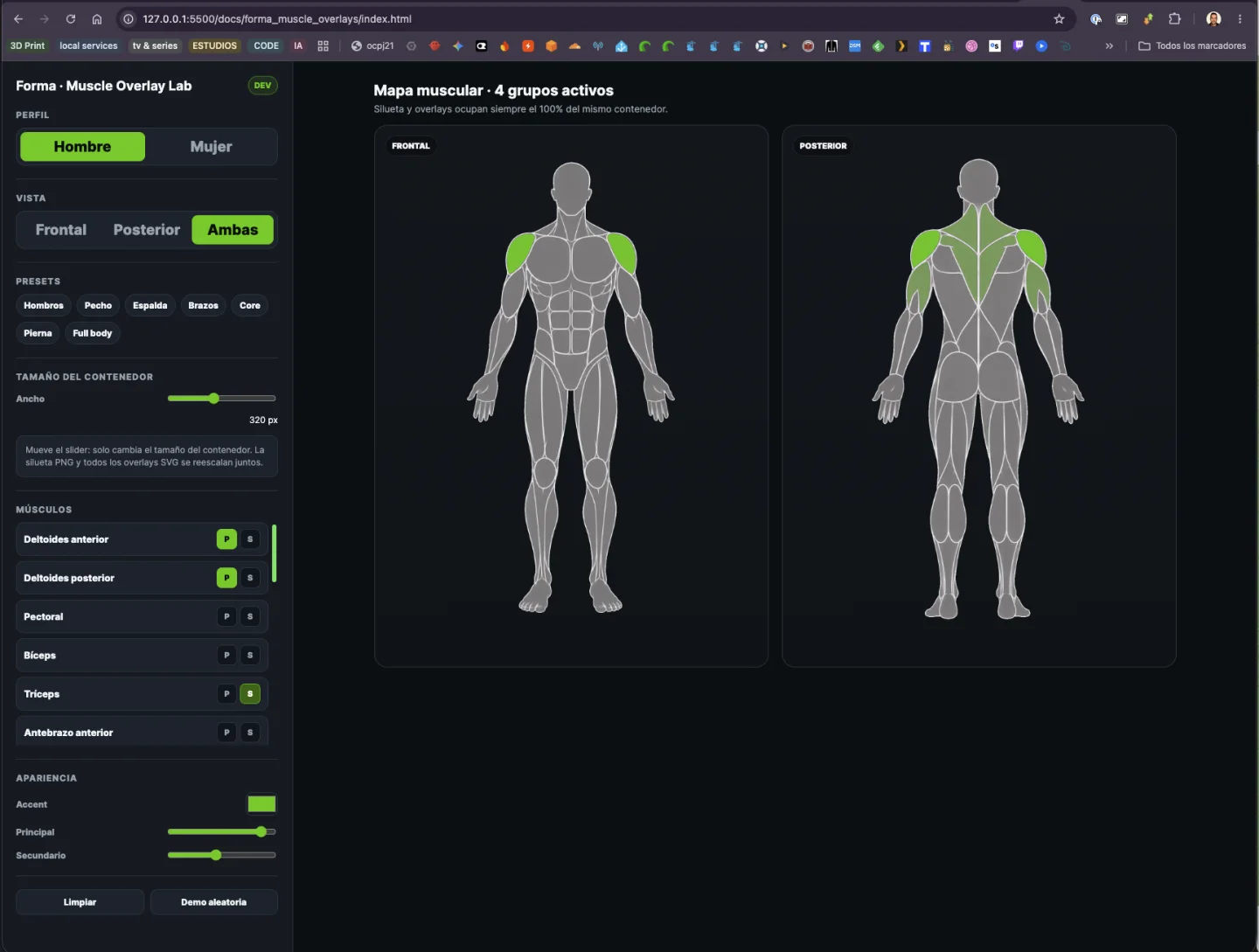
The same lab with the female profile and six groups lit, checking the female pack lines up just as well:
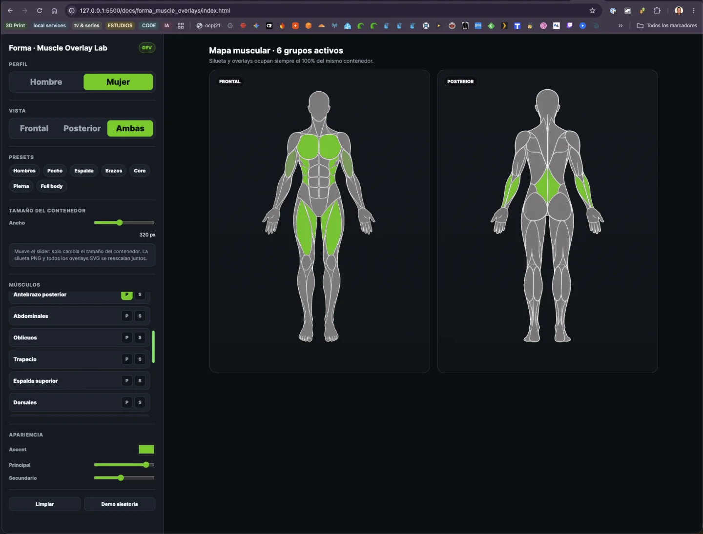
That pack lives in the repository as documentation, not as production assets, with a README that says so in its first line so nobody edits it there expecting the screen to change. What the app serves is the same silhouettes in WebP: the original PNGs weighed 6.1 MB and came down to 700 KB, with the pixel dimensions untouched. That last part is non-negotiable — the masks stretch to that exact box, and one pixel of drift puts the muscle in the wrong place.
The six muscles we don't light
And here's the decision I'm proudest of this week, which consists of not doing something.
The exercise catalogue speaks Spanish ("cuádriceps", "dorsal", "core"). The
silhouette pack speaks in codes (QUADRICEPS, LATS, ABS). Crossing them
left six pack codes with no equivalent: forearms, adductors, tibialis, lower
back, soleus. There simply aren't any exercises in the catalogue naming them
yet.
We could have approximated. If an exercise says "leg", light up the quadriceps and move on. It would have looked more complete, fuller, better in the screenshot.
We decided not to:
Lighting the wrong muscle is worse than lighting none.
A map that shows more than it knows stops being information and becomes decoration. The only two cases that did get a translation were agreed one by one — "core" is abs plus obliques, "rhomboids" is upper back — not by a similarity rule. The rest stay dark until there's an exercise that justifies them.
A test that measures the function, not the value
For the contrast problem, what got fixed wasn't only the colour.
The test that was supposed to protect us compared one hex literal against another hex literal. When we changed the green, that test failed saying, in effect, "the expected value no longer matches". Which is the least interesting thing about it. The test had no idea what that token was for.
It now computes the real contrast ratio — the WCAG 2.1 formula, no new
dependencies — for the four text tokens against both of the app's surfaces. If
someone deliberately picks a different green tomorrow, the test stays green. It
only fails when the token stops doing its job, and it says so in those words:
--color-accent-strong on --color-bg: 2.77:1 is below the AA 4.5:1 bar. We
verified it in the negative, by re-injecting the bad colour.
The buttons ended up as three families, separated by what they express rather
than how they look: Button for a labelled action, IconButton for an action
without a label, and Chip for a selection. Chip exists precisely because
a selected chip and an accent button look nearly identical and mean opposite
things — and that resemblance is why somebody copied it three times under three
names.
The playground
The answer to "I have no backend" was already half-written in the repo. The layout tests intercept the API inside the browser with a table of fixtures, and among them is the endpoint that says who you are. That is exactly what makes the session real.
Out of that came a playground mode: a real Chromium with those same fixtures, which opens the app already "signed in" and waits for you to close the window. With hot reload, because the ordinary dev server is still behind it.
The screenshots in this post were taken with it.
What didn't work out
We evaluated the morphicons icon set across both repositories, analysed where it would fit, picked an option, looked at it locally, and the verdict was: "I don't like it, leave it as it was". Zero lines merged. That's part of the job.
On Sunday afternoon several agent sessions got stuck in the background, tmux attach returned garbage characters, and in the end they had to be killed by
hand. And one of my sessions died and restarted itself in the middle of
reorganising the iPad card.
We also changed the "NEW VERSION 4.0 AVAILABLE" line on the landing page, for a very simple reason: it was a lie. It now advertises the Mercadona shopping list, which actually exists.
What we learned
- The helper tool deserves a commit. Neither the overlay lab nor the playground is production code, and both are in the repository: one documents a technique, the other makes it possible to test the app without a backend. Working on an interface with AI goes far better when there's somewhere to look at the result in isolation from the rest of the system.
- Data that only appears as text is only half shown. The muscle map had been in production since July. What changed this week wasn't the data — it was what we do with it.
- Mask, not image. It's the difference between an asset that obeys the theme and one that imposes its colour.
- A test that compares a hex protects nothing. It protects the value, not the function. Measuring contrast turns "the test is out of date" into "this can't be read".
- Don't approximate. Six muscles stay dark because the catalogue doesn't name them yet. Filling the gap with the nearest neighbour would have looked better and been wrong.
What's next
Merging the PR that carries all of this, which is still open as the week closes. A day with two different strength sessions still shows only the first one's map. And date navigation is still bounded to the Monday–Sunday of the current week, because the training API doesn't know about dates — it only knows "the week"; going beyond that needs a new endpoint, and that's no longer frontend work.
The week in numbers
| PRs merged in Forma | 2 (#230, #231) |
| PRs open at close | 1 (#232) |
| Project total | 224 PRs merged |
| Lines (merged) | +5,890 / −2,287 |
| Lines (open PR) | +3,703 / −254 |
| Database migrations | 0 |
| CSS modules drawing their own buttons, before | 35 |
| Control families, after | 3 (Button, IconButton, Chip) |
--color-accent-strong contrast |
2.77:1 → 4.70:1 |
| Silhouettes in the pack | 8 (2 sexes × front, back, running, rest) |
| Muscle SVG masks | 46 |
| Pack weight | 6.1 MB → 700 KB in WebP |
| PRs on this blog | 1 (#23) |
| Claude Code working sessions | 11 |
| 5-hour windows consumed | 12 (Monday to Sunday) |
| Weekly window | held out until Sunday night |
| My own prompts | 56 (48 in Forma, 8 on the blog) |
| Skills used | work-unit-commits, branch-pr, update-config, recap |
A note on the screenshots: they were taken against the app at the last commit of the week, in playground mode, with sample data and no real backend. Nothing shown here is my actual health data. The two Muscle Overlay Lab captures are of the tool running locally; it is not part of the deployed application.