
The day of the week was my primary key
17–23 August in Forma. On a Monday morning the app claimed I'd already done two training sessions. The card was adding up correctly: the bug was a text string that fused what a session is with when it was due. The rest of the week came out of that.
What we set out to do
Forma is the training and nutrition app I'm building with AI agents. The week before, we'd finished the muscle silhouettes: the training cards now show which muscles each session works.
This week started with no plan at all. I opened the app on a Monday at eight in the morning to look at something else, and the "Weekly summary" card told me 2 of 6 sessions completed. I hadn't trained at all. Not that Monday, not the Sunday before.
Pulling on that thread took the whole week, and it ended up touching three things I'd been treating as separate:
- Teaching the app which week it is. Which was the real bug behind the 2/6.
- Making the Training page fit on one screen. It forced you to scroll, and I assumed that was a space problem.
- Getting the landing page to stop promising things that don't exist — and getting the funnel to stop throwing away everyone who completes it.
The thread that connects them only became visible at the end, and it's the one this post is named after.
The problems we ran into
Monday said I'd already trained
My first hypothesis was the obvious one: the card is counting wrong. It was false. The card was counting perfectly. The problem was three layers down, in a table storing one row per user and session, where the session was identified by a text string:
"MONDAY:RUNNING"
That's the entire bug, right there in that string. The day of the week WAS the session's identity. And nowhere in the schema was there anything recording which week that row belonged to.
From that single modelling decision — made months ago, in five seconds, with nobody arguing about it — came two problems I'd been treating as unrelated:
The first: the state never expired. A session completed in any past week was reapplied to every week after it, indefinitely. I'd gone looking through the code for the "weekly reset", assuming it was broken. It wasn't broken: it didn't exist. You can't reset against a week the model doesn't know exists.
The second: sessions couldn't be moved. I wanted to push Monday's easy run to Tuesday, which is what happens in real life. And it wasn't that we hadn't written that feature yet: the model made it impossible to write. Changing the day would have changed the session's identity, not its date. Tuesday's session wouldn't be Monday's session moved; it would be a different session entirely.
Two symptoms, one mistake. The string fused three facts into one:
WHAT it is        -> session_key    ("RUNNING:EASY", "STRENGTH:PUSH")
WHEN it's due     -> scheduled_day
WHEN it was done  -> completed_at
Splitting them was a small migration. The expensive part was taking months to see it, because from above the symptom was a card that couldn't add up.
The page didn't need more space: it said the same thing three times
With the state finally correct, the Training page still forced you to scroll. I spent a while thinking about how to compress the cards. Wrong question.
"Today's training" and "Weekly calendar" were the same day drawn at two
sizes, and they had to be kept in sync by hand. And "Weekly summary", the
"Sessions completed" counter and "Weekly distribution" were all counting exactly
the same sessions. The 1/6 was printed in three different places at three
different sizes. Those aren't three cards: they're three opportunities to
contradict each other, and three rows of height.
And when the two elements finally landed in the same strip, something surfaced that had been hiding for months: for the same session state, one component said "Pending" and the other said "Planned". Two words for one thing. They'd coexisted peacefully while they lived in separate cards, four hundred pixels apart. The moment they sat side by side, the mismatch was impossible to miss.
This has happened to me enough times to call it a rule: vocabulary mismatches aren't found by reading the code, they're found when two components land in the same strip.
A bug 0.31 pixels wide
Mid-week I rebuilt the landing page and left the main branch red. The test said the "Create my free plan" button broke onto two lines on a phone, but it only failed on CI: on my Mac it passed cleanly.
For a while I assumed it was a runner quirk. I was wrong. Measured in the browser, at 375 pixels wide:
content box     206.00 px
text width      205.69 px
slack             0.31 px
Less than a third of a pixel. The font was loading in both places — that was the first thing I checked, because "the typeface didn't arrive" was the obvious hypothesis, and it was false — so what tipped it over was simply how each operating system rasterises letters, which always differs by more than 0.31 pixels between platforms.
The defect wasn't in CI: it was in a design resting right on the edge, and CI was the only thing that noticed.
The fix was widening the button until it had 12% slack. But what I took away is the test: the one we had only noticed once the label had already broken, which is too late and platform-dependent. The new one measures how much room is left and demands 8%, so it fails while there's still time to fix it. And I verified it failing against the old value, so it isn't an empty guard.
The success screen wasn't saving anything
On Saturday night I asked a question I should have asked much earlier: is the email address of someone requesting a plan stored anywhere?
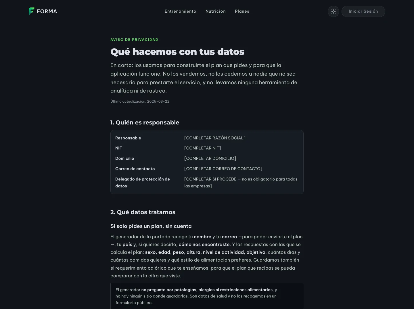
No. The endpoint validated the funnel's four screens and answered yes. Nothing else. Someone would fill in the whole form, hand over their email, see a success screen, and not a trace of them survived the request. The controller itself said so in capitals in a comment, and called it "the first thing to fix".
Worse: the last step had a "I've read the privacy notice" checkbox, and that link was a 404. So we were collecting consent about a document nobody could read.
This is where the exercise got interesting. As a reference I handed the agent another product's privacy page from the same sector, and it came back saying it wouldn't do: it was Mexican. "ARCO rights" is Mexican law; we're under GDPR, which grants six rights rather than four, and requires things that page didn't have — legal basis, retention period, how to withdraw consent, and which authority to complain to. Copying its structure would have produced a document that looked like a legal notice and carried zero legal weight.
Two details from that part that I think travel furthest of anything this week:
- Proof of consent is three columns, not a boolean. What was accepted, when,
and which version of the notice was in force at that moment. GDPR asks you to
be able to demonstrate it, and a
truedemonstrates nothing. And the version is set by the server, never by the browser: the browser is precisely the party that can lie about which document it read. - Retention is counted in calendar months, not days. If your notice says
"twelve months" and you delete after
12*30days, you're deleting nearly a week earlier than you declared. What you declared is what governs.
How it ended up
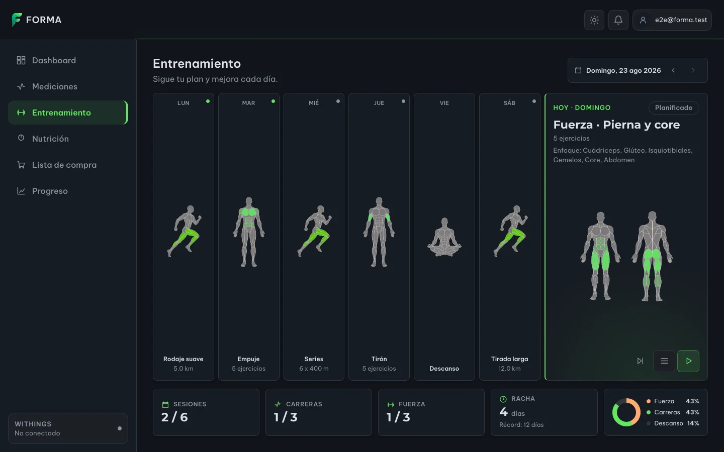
The Training page no longer has a "today" card and a separate calendar: the week IS the page. Seven columns, and today is simply the one that opens.
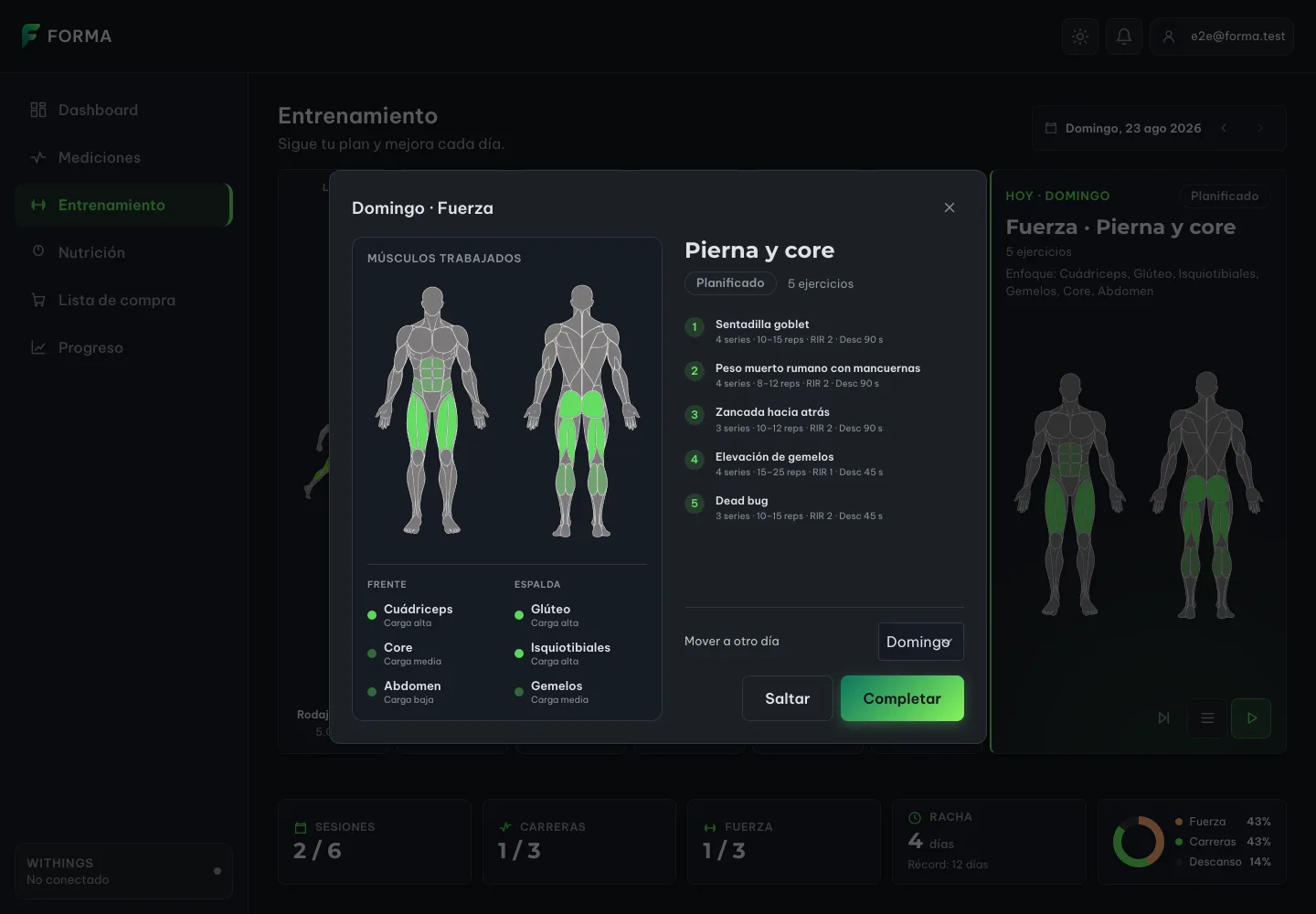
Opening a session's detail brings up the real exercise breakdown next to the muscle map. And at the bottom left is the thing the old data model made impossible: moving the session to another day.
The landing page was rebuilt around the one thing Forma draws that nobody else draws: the muscle map. It had been buried inside the app while the hero showed a stock photo of a phone. And it isn't a screenshot of the component: it is the component, so the landing page and the app can't drift apart.
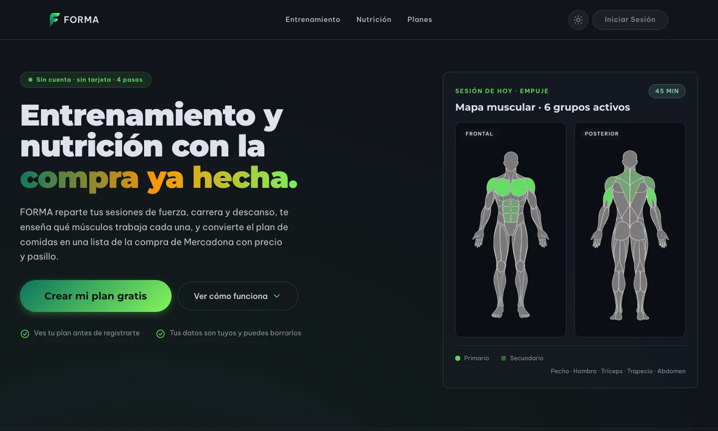
In the same move, the landing page lost its promise of Garmin and Apple Watch integration, a "98%" and a "proprietary algorithm". None of the three exist. If it isn't built, it isn't advertised.
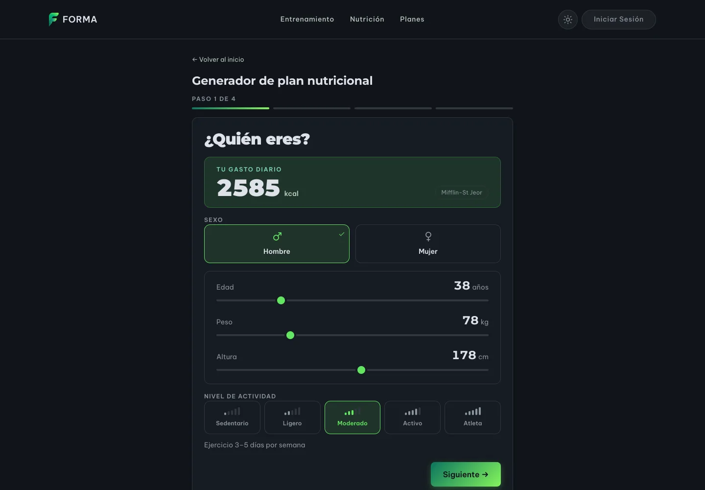
The funnel was reordered into a single column around a live number: as you drag the sliders, the daily energy figure recalculates above them. That number is what makes answering the next question feel worth it.
And now, when someone accepts the privacy notice, there's a privacy notice to accept. With the controller's details still to be filled in, marked in plain sight: there's a test asserting that they are visible, precisely so nobody forgets them.
A detour that saved the week
Mid-week I lost an afternoon on something that wasn't a feature: being able to see the app.
This laptop has no Docker, so there's no backend and no database, and without a backend the private part of the app won't open: authentication is server-side, so starting the frontend on its own only lets you browse the landing page. I'd spent weeks judging redesigns against tests and mockups, without looking at them.
We already had fake data for the automated tests. What I did was push it down one layer: instead of the test browser serving it, the development server serves it. Same source, two consumers, zero copies that can drift. And suddenly the app is browsable in a normal browser, at any window size, with real devtools.
Every screenshot in this article was taken with that. The tool I built grudgingly on Wednesday is the one that let me photograph, on Sunday, what I'd built the rest of the week.
What didn't go well
- I left the main branch red for four days, with two chained branches inheriting the failure, because I accepted the comfortable explanation ("it's a fussy test about the typeface").
- Twice I forgot CI checks I already knew existed. Passing the tests is not passing the build.
- The big redesign was implemented blind. It was validated against 924 tests and against the design, not against my eyes. That's exactly what the tooling detour set out to fix, but it arrived two days late.
What I'm taking away
If an identifier contains a fact that can change, it isn't an identifier: it's
two columns fused into one. "MONDAY:RUNNING" fused what-it-is with
when-it's-due, and that single mistake produced two bugs that looked entirely
unrelated. When two odd symptoms refuse to be fixed separately, it's often
because they share a column.
And the corollary, which is what tidied the whole week for me: duplicating a
view isn't duplicating pixels, it's duplicating the opportunity to contradict
yourself. The 1/6 in three places was three independent truths that happened
to agree.
Next week: getting the generator to actually build the plan. Right now it stores the request and the consent, but there's still nobody on the other side.
The week in numbers
| PRs merged in Forma | 14 (#233 → #247) |
| Project total to date | 234 PRs |
| Lines | +15,076 / −4,351 across 150 files |
| Database migrations | 2 (Flyway V60 and V61) |
| PRs on this blog | 1 (#25) · 1 deploy to production |
| Working sessions with Claude Code | 8 |
| 5-hour windows consumed | 15 |
| Weekly window | not exhausted |
| My own prompts | 107 |
| Skills used | branch-pr, chained-pr, work-unit-commits, design |
A note on the screenshots: they're taken against the app at
the last commit of the week, with sample data and no real backend. Nothing you
see here is my own health data. The [COMPLETAR …] fields on the
privacy page are meant to show like that.