
My app stopped inventing numbers
3–7 August in Forma: we built the public nutrition-plan generator, wired up the funnel from the landing page, and got the screens to stop showing filler figures and read the real plan instead. These are the problems we ran into along the way.
What we set out to do
Forma is the nutrition and training app I'm building with AI agents. The week before, we'd finished the catalogues: foods, macros, servings, store products. All the plumbing, and nothing you could see.
This week was the opposite. Three things, none of them small:
- Make the nutrition plan actually exist. Until Monday, the entire plan was three constants hand-written in the code. Nobody could edit it, it didn't change from one week to the next, and it was the same for anyone who signed up. A plan you can't change isn't a plan — it's decoration.
- Build the funnel. A public generator on the landing page where someone who doesn't know the app answers four questions and gets a plan, without creating an account first. Asking for a sign-up before showing anything is the most efficient way to make sure nobody starts.
- Make the screens stop lying. This is the uncomfortable one. Several screens were showing filler numbers — figures dropped in "for now", months earlier, so the mockup wouldn't look empty — and they were still there, next to real data, indistinguishable from it.
The third one ended up being the thread of the whole week, for a reason I didn't see coming.
The problems we ran into
The catalogue didn't know if the rice was raw or cooked
The first one showed up on Monday, closing out the data model, and it was the kind that makes you stop.
The nutrition document the whole design came from says, verbatim:
100 g of rice = 250 g of potato
When the app computed it from its own catalogue, the answer was 465 grams. Nearly double.
It wasn't a maths bug. The document was thinking of cooked rice and the catalogue stored dry rice — 360 kcal per 100 g against roughly 130 — and nowhere in the system was there a field saying which of the two those numbers were. Not one. The catalogue had been ambiguous for weeks and nobody could tell, because ambiguity doesn't show: what shows is a number.
The nutrition screen was contradicting itself
On Wednesday, Diego opened the app with his account and the nutrition screen showed him two incompatible things at once: at the top, the day's target, 2350 kcal. Below it, on the same screen, "there is no meal plan for this kind of day".
Those two statements came from two different parts of the backend reading the same plan under different rules. And behind that was something worse.
For months, all the app's seeded data hung off a placeholder account — an internal, inactive user created to have somewhere to put things before login existed. When someone finally signed up for real, the app minted them a fresh, empty account, and the circle never closed: eighteen tables of data hanging off a ghost, and the real person staring at blank screens.
And the finding that showed up three times
This is the one the post is named after.
As we started wiring screens to real data, the same pattern kept appearing. The screen showed an invented figure. Right next to it, a code comment explaining why: "the endpoint doesn't exist yet".
And the endpoint existed.
Per-meal macros had been coming off the server for weeks; the screen was one line short of reading them. The hydration data had endpoints to read and to log from even longer ago, under a comment that said, literally, with the word verified in it, that no such endpoint existed anywhere. Nobody had gone back to check.
Three times, across two different projects, the same story: the work was already done, and what was missing was the path to reach it. On this very blog the same thing happened on Monday: the English version existed, complete and translated, but had no address of its own. To Google, it simply didn't exist.
The lesson isn't "re-read your code comments". It's more uncomfortable than that: a filler value outlives the excuse that justified it. The excuse expires silently and the filler keeps painting itself on every screen, every day, looking exactly like real data.
How we solved it
The plan moved into the database
Four chained deliveries moved the nutrition plan out of the code and into four tables: the plan, its days, each day's meals, and each meal's foods. Then a screen to create and edit plans. And finally, a link between what you eat and the meal the plan asked for, so the app can answer "did I eat what I was supposed to?".
The rule we held across the whole model was never store what can be computed. A day's calories are the sum of its meals: storing them separately would freeze a number that ought to move on its own. A meal's state — eaten, pending or skipped — isn't stored either, because pending turns into skipped without anyone touching anything, simply because the day ends.
For the rice, we added a preparation state to the catalogue: raw, cooked, or as-is. And here we did something worth telling: of the catalogue's 23 foods, we filled in two. The only ones that could be settled without guessing. The other 21 were left empty, deliberately, because "nobody has decided yet" is a different answer from "not applicable", and filling them in for convenience would have put 21 guesses into the catalogue wearing the clothes of verified data.
The funnel, four steps from the landing page
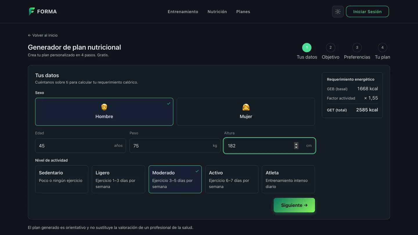
The public generator came out like this. Step one: the basics, with the energy calculation appearing in the right-hand panel as you type.
Step two: the objective, and the panel updates to explain the whole calculation — total expenditure, the objective adjustment, and the calories the plan will carry.
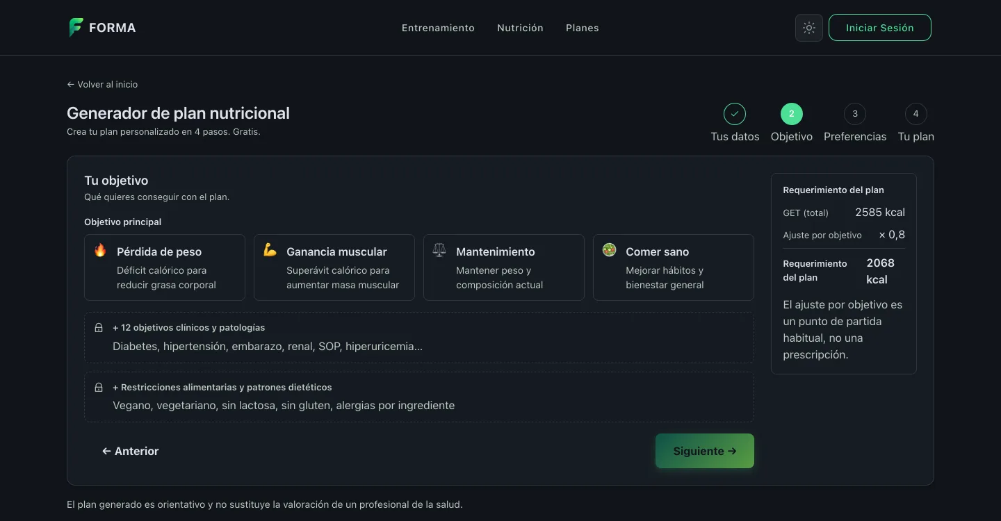
That panel holds the most important design decision of the week, and you can't see it. The formula behind those numbers lives on the server, not in the browser. We could have written it in the frontend too — it would have been faster and needed no round trip — but then there would be two copies, and the moment one drifted, the number that convinces someone on the landing page would stop being the number their plan is built from.
The two locked blocks in step two are deliberate as well: conditions and dietary restrictions are shown and not asked for. They're health data, and collecting them in a public form without using them yet would be the worst of both options.
A plan that's offered, not assumed
The fix for the contradiction came out better than the problem. Instead of patching the two rules to agree, we changed the framing: the plan is offered, not imposed. It's prepared switched off, and the first time you come in the app asks.
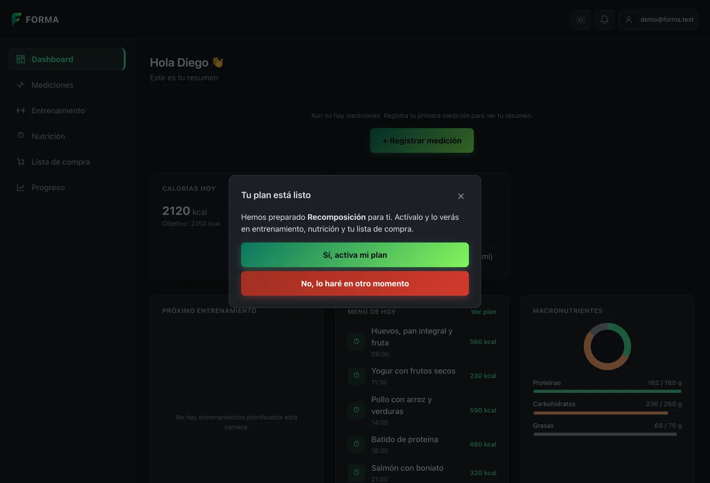
With that, the contradiction disappeared on its own: while the plan is unactivated it simply doesn't appear anywhere, so both screens say the same thing by construction rather than because someone synchronised them by hand.
And yes, that red button is flagged for review. Red usually warns about something irreversible, and declining here destroys nothing.
The nutrition screen, counting a single day
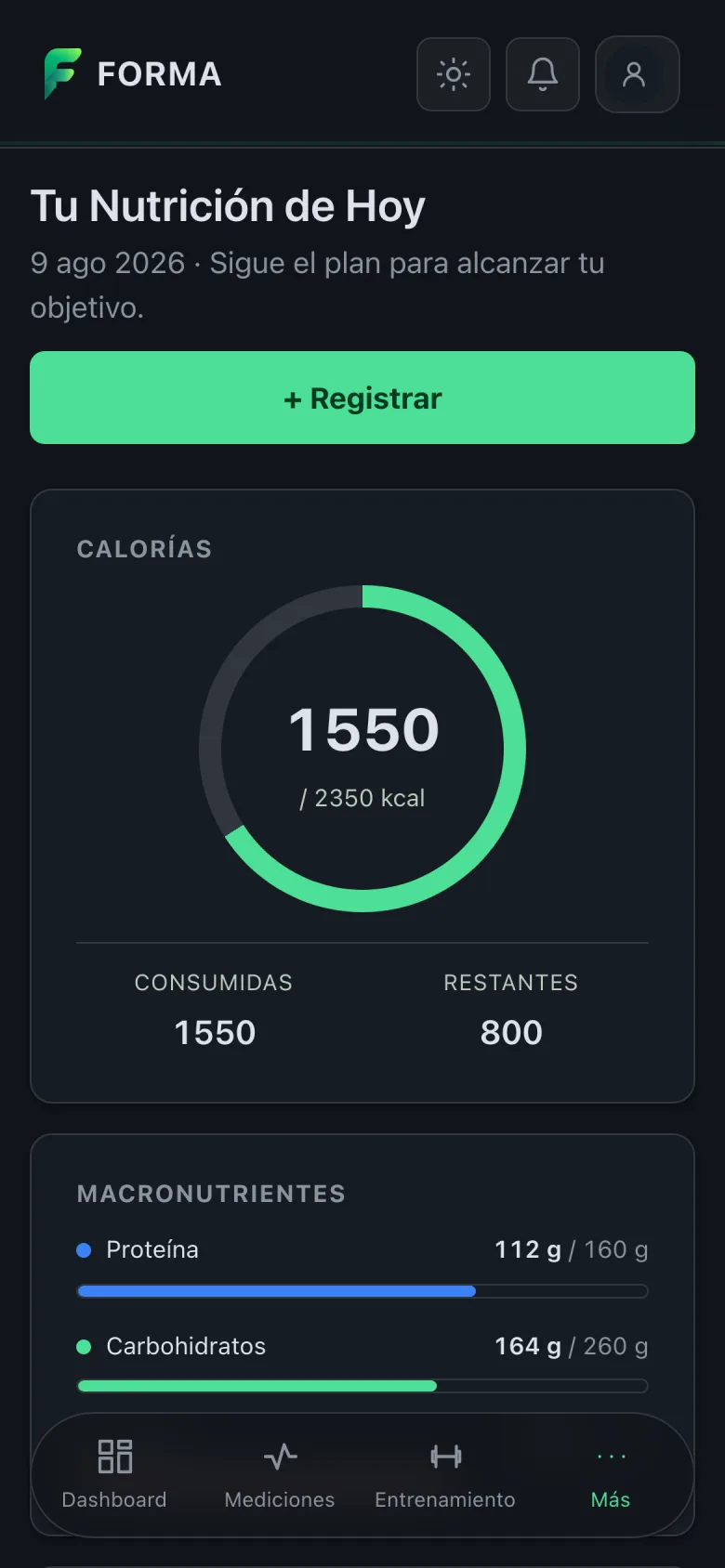
The last thing of the week was rebuilding the nutrition screen. It used to ask two questions at once and let the answers coexist; now it asks one — today — and everything it shows comes from the plan and from what's been logged.
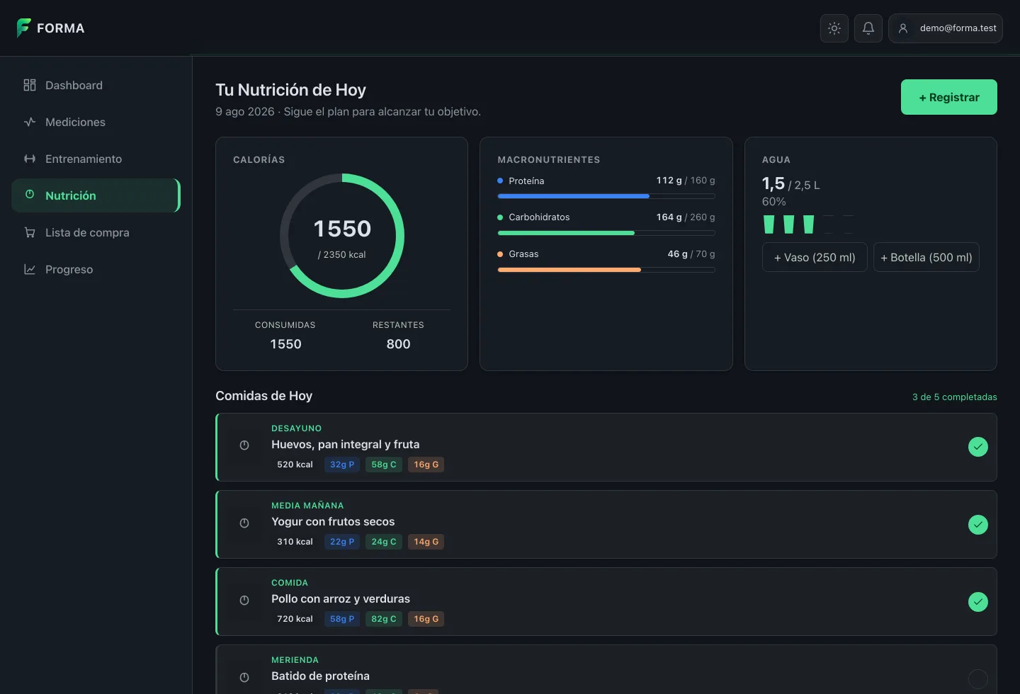
Not one number on that screen is invented. The calorie ring, the macro bars, the glass of water and the day's five meals all come from real data. Each meal shows the recipe it's meant to be — "Eggs, wholemeal bread and fruit", not a generic "Breakfast" — with its macros in coloured tags, and the counter at the top says how many you're through.
What there isn't is meal photography. The mockup asked for one per dish and nowhere in the system stores food images. Rather than a stock photo of a plate nobody cooked, the frame keeps the icon.
And on mobile:
Takeaways
A filler value outlives its excuse. The most useful thing this week, and the one I'm turning into a periodic review: what does the backend already have that no screen is asking for? The answer, three times running, was "more than I thought".
Empty is an answer. The 21 foods with no preparation state say something true: nobody has decided. Filling them in would have been more convenient and would have turned guesses into data, which is the fastest way to poison a catalogue.
A business formula lives in exactly one place. If the number you show to convince and the number you build from come from two implementations, sooner or later they drift. And you'll find out from a user.
Fixing the framing beats patching the symptom. The nutrition screen's contradiction could have been papered over by making two conditions match. Changing the question — offering the plan instead of assuming it — removed it at the root and settled what to do with a freshly created account along the way.
What's next
Today the funnel computes the requirement and collects the data, but doesn't generate the plan yet. The next step is closing it end to end: generate the plan when the four steps finish, email it as a PDF, and leave it stored waiting for the person to decide to switch it on. With that, the onboarding screens — which don't exist yet and which the activation modal is currently standing in for — stop being needed in their current shape.
After that, expanding recipes into the shopping list, and giving that list store preference and an incomplete-budget warning.
And the limit that cut the week short
There's a reason this story ends on Friday and not on Sunday: first thing Friday morning I ran out of my Claude Code weekly window.
You can see it in the data without me saying so. Monday and Tuesday are full days, morning through to the small hours. Friday crumbles into fragments — half an hour here, ten minutes there — and Saturday has no session at all. I spent Friday and Saturday waiting for the reset, which lands for me on Saturdays around ten at night.
What happened on Saturday is worth a mention: the work carried on without me. Another agent picked up the shopping-list WIP and shipped three more PRs. That's deliberately out of this recap — it's another hand's work and deserves telling separately — but it says something about how this is set up: the bottleneck stopped being the hours available and became the quota.
It's a new and fairly concrete constraint when planning. Front-loading the heavy work into the start of the week is no longer a matter of taste: it's what decides whether Friday exists.
The week in numbers
| PRs merged in Forma | 36 (#191 → #226) |
| Project total | 219 PRs |
| Lines | +32,886 / −3,743 |
| Database migrations | 17 (Flyway V42 → V58) |
| PRs on this blog | 2 |
| Claude Code working sessions | 7 |
| 5-hour windows consumed | 14 (Monday to Friday) |
| Weekly window | exhausted Friday morning |
| My own prompts | 103 |
| Total messages across sessions | ~8,300 |
| Skills used | branch-pr, chained-pr |
A note on the screenshots: they are taken against the app at the week's last commit, with sample data and no real backend. Nothing shown here is my actual health data.