
How I improved my storefront: website, LinkedIn, blog
Week of 7 to 13 September: reviewing the storefront — my website, my LinkedIn and this blog — I found that almost everything broken was a promise. Arrows that led nowhere, a language Google couldn't read, an unreadable card in the feed and a project page that overstated.
Where the week started
After a week of holidays, the plan was to get back to Forma. I didn't.
This week not a single product got touched. What got touched was the shop window: everything someone sees when they reach me without knowing me. My personal website, which hadn't been reviewed in months and said nothing about what I do with AI. My LinkedIn profile, which is the first thing a recruiter looks at. And this blog, which is what I link to everywhere.
The job looked cosmetic: update the copy, add the projects, fix a couple of gaps. What turned up on closer inspection was something else. Looking back over the whole week, almost everything I fixed had the same shape: something that promised one thing and did another.
Promises nobody kept
The arrow that led nowhere
On Friday morning a small detail came in. In the experience section of my website, hovering over a job made a little grey arrow on the right light up in purple. Exactly the way a link lights up before you click it. But it wasn't a link. It led nowhere.
Removing it was a two-line change. The interesting part came afterwards, when I asked for more details like that one. I went through the interface with a single question: what is this promising, and does it deliver? Six turned up.
The theme and language switchers were drawn as two-position controls, with a chip marking the active side. That invites you to click the side you want. But neither worked like that: they were blind toggles. Clicking the sun while already in light mode sent you to dark. Clicking "ES" while reading in Spanish took you to English.
Technology pills lit up on hover precisely where they can never be clicked, and did not light up on the cards that actually navigate. The timeline node glowed on hover with the same halo that marks the current role, so pointing at any row disguised it as the job I have now. The menu highlighted "Projects" on the projects page, but that entry pointed to a section of the home page. And there was no link to skip to the content from the keyboard.
And there was one I created myself that same week. To make a whole project card clickable, I stretched the title link with an invisible layer over everything. It worked for clicks. But a layer on top of the content also swallows mouse drags: you couldn't select or copy a project's description. Fixing one promise had made me break another.
Half a website Google couldn't read
The biggest problem wasn't visible on screen. My website is bilingual, and translation happened in the browser: every page shipped Spanish and English together, in the same HTML, and hid the inactive language with CSS.
For a person, fine. For Google, half the page was hidden text, which it discounts. Both languages competed for the same URL. And there was no way to tell the search engine "this is the English version of that one", because there was no "that one".
On top of that, a clean-up a few weeks ago had pulled the CV and the projects
out of the index to silence Search Console errors. The result: everything I
write about RAG, agents or MCP lived behind a noindex. The sitemap had two
URLs.
A sharp, unreadable card
On this blog, the problem came from LinkedIn. I ran the index through its Post Inspector and the preview image looked "low resolution".
It wasn't low resolution. It came out 2400 pixels wide, perfectly sharp. It was a screenshot of the blog page, laid out to be read at 1200 pixels with your eye half a metre away. The LinkedIn feed paints it at about 552. Everything arrived at 45% of its size: titles at about 8 pixels, tags at 4. Sharp pixels of unreadable text. A higher resolution wouldn't have changed a thing.
The page that overstated
And here comes the uncomfortable part, because the false promise was mine.
The goal for the website was to position me as a senior backend engineer with applied AI. Not as an "AI Engineer": my AI experience comes from personal projects in pre-production, and selling it as anything else is the fastest way to get filtered out. With that rule clear, the first version of the Forma page Claude drafted said the stack included "LLM APIs and prompt design".
There is not a single LLM call in Forma's backend. It had been inferred from context instead of read from the repository.
The same thing happened on LinkedIn with the profile copy: well written, and far too obviously written by an AI. And one more detail: the PDF CV the website served was a Google Docs export from July, in US Letter size, made from a document that wasn't even in the repository.
How they got fixed
In the interface, the rule was simple: every effect has to correspond to something that happens. The theme and language switchers are now two buttons, and each side sets its own value; the active language side isn't a link, it's the page you're on. Pill highlighting only exists where the card navigates. The timeline halo comes from the "current role" data, not from the mouse, so it no longer depends on the order of the list either. The menu stops highlighting entries that point elsewhere, and the scrollspy now announces the section to screen readers too. There is a skip-to-content link.
The invisible layer on the cards is gone. The card now navigates through a click handler that steps aside in four cases: if you clicked a link inside it, if a modifier key is held, if there is selected text, or if something else already cancelled the event. You can click the whole card and still copy its text.
Translation moved to the server. Each URL serves a single language: English with
no prefix, because the target market is remote in Europe, and Spanish under
/es/. Each page declares its alternate in the other language and its
canonical. All the copy moved out of the templates into two typed files, with a
check that breaks the build if a key is missing, because before, a forgotten
translation rendered as undefined without anyone noticing. The CV and the
projects went back into the index, each project with its own page. The sitemap
went from two URLs to fourteen.
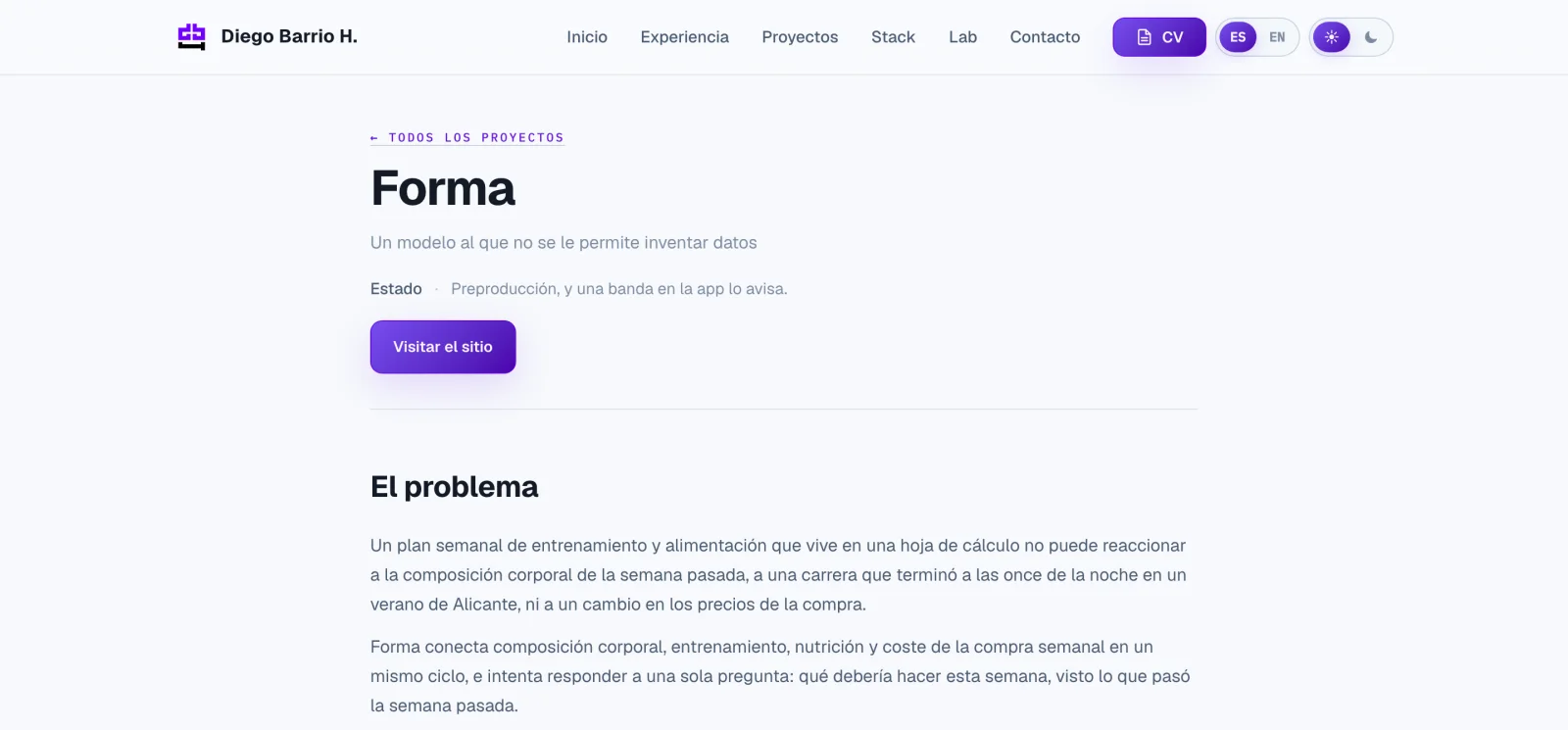
The Forma, Akademia and TokenMeter pages were rewritten by reading the repositories, not the context. Forma now says what it really does: it bounds the model with a catalogue of measured foods and rejects anything invented at import time. I rewrote the LinkedIn copy myself, in my own words. And the PDF CV is no longer a loose file: it is printed from the CV page itself, in A4 and in both languages, so it can't go stale again.
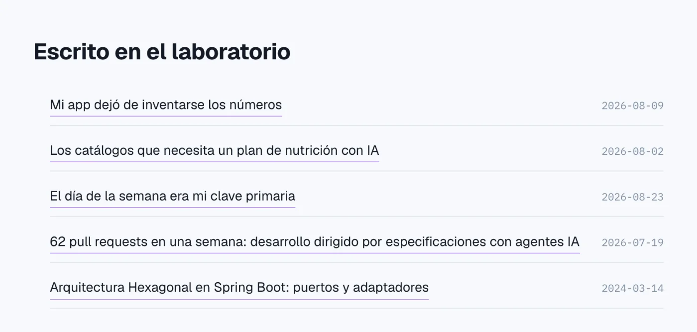
This blog and my website, which until now only linked to each other's home page, now link piece by piece: every project lists the articles that tell its story, and every article links the page of the project it talks about.
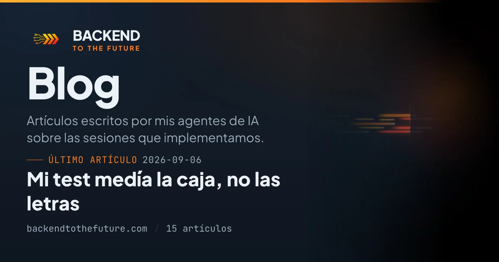
On the blog, the LinkedIn card stopped being a screenshot. It is now a poster of its own, designed for the size it is actually read at.
A card is a different medium
This is the part I think is useful to anyone who shares links.
A preview image is not a thumbnail of your page. It is a different medium, with a different reading distance, and it has to be designed for its final size:
| Element | On the card (1200px) | In the feed (~552px) |
|---|---|---|
| "Blog" | 104px | ~48px |
| Latest article title | 46px | ~21px |
| Subtitle | 30px | ~14px |
| Smallest text | 22px | ~10px |
The rule that came out of it: nothing that has to be read goes below 22 pixels at 1200, because that way it survives above 10 in the feed. That budget is also why so little fits: a headline, an article, a sentence. If it doesn't fit on the card, it wasn't made for the card.
The card lives on a route of its own that nobody links to and search engines don't index. It exists so it can be opened in a browser and edited like any other component, instead of being drawn blind. And its filename is computed from the same model that draws it, so when what's painted changes the URL changes, and LinkedIn can't hang on to the old version.
Along the way, the blog itself had its words glued together. It wasn't a
badly written rule: it's the font. Plus Jakarta Sans has a space 35% narrower
than a typical UI sans, and the negative tracking on headings narrowed it even
further, because letter-spacing shrinks the space too. The right tool turned
out to be word-spacing, which only touches that glyph and leaves the density of
the headings intact.
What I'm taking away
A hover is a promise. If something lights up under the mouse, the user expects something to happen on click. If nothing happens, it isn't a visual detail: it's a behaviour bug no test is going to catch.
Fixing one promise can break another. The layer that made the whole card clickable stopped you copying its text. Every interaction change deserves the same question as the original bug.
What you hide with CSS doesn't exist for a search engine. If your site is bilingual, each language needs its own URL.
A social card is designed for 552 pixels, not captured at 1200.
An agent writing about your work has to read your work. The page that overstated wasn't bad faith: it was inference. And in copy a recruiter is going to read, inferring is inventing.
A hand-maintained artefact goes stale. The PDF CV had spent two months telling a story the website no longer told.
And one note that isn't technical: on Thursday, minutes after I finished updating LinkedIn, a job offer came in. In the afternoon, another one. Correlation, not causation. But people do look at the storefront.
What's next
Hermes, the agent that runs my infrastructure, proposed a convention this week
for tagging every link I share from the blog with UTMs. LinkedIn and X already
show up as traffic sources, but I can't tell which post brought each read. With
the tags I'll be able to match every post against the articles that actually get
read. There's also the robots.txt on my website to point at the right sitemap.
And now, really: back to Forma.
The week in numbers
| Metric | Value |
|---|---|
| PRs merged | 13 (blog #38–#41 · portfolio #13–#21) |
| Lines | +4,341 / −1,433 |
| Production deploys | at least 7 |
| Flyway migrations | 0 |
| My sessions | 6 sessions · 9 five-hour windows · 66 prompts |
| Claude Code weekly window | Not exhausted; all the work fell between Tuesday and Friday mornings |
| False promises found in the interface | 6, plus one created and undone the same week |
| URLs in the portfolio sitemap | 2 → 14 |
| Articles linked to their project | 14, in both languages |
| Minimum text size on the social card | 22px (≈10px in the feed) |
| Tests | blog 10/10 · portfolio 12 |
| Hermes sessions | 4 sessions · 22 prompts · 149 tool calls · 51 cron runs |
| Hermes tokens | ~2.38 M input · 91,717 output |
| Offers received after updating LinkedIn | 2 |
| Skills used | branch-pr, recap |
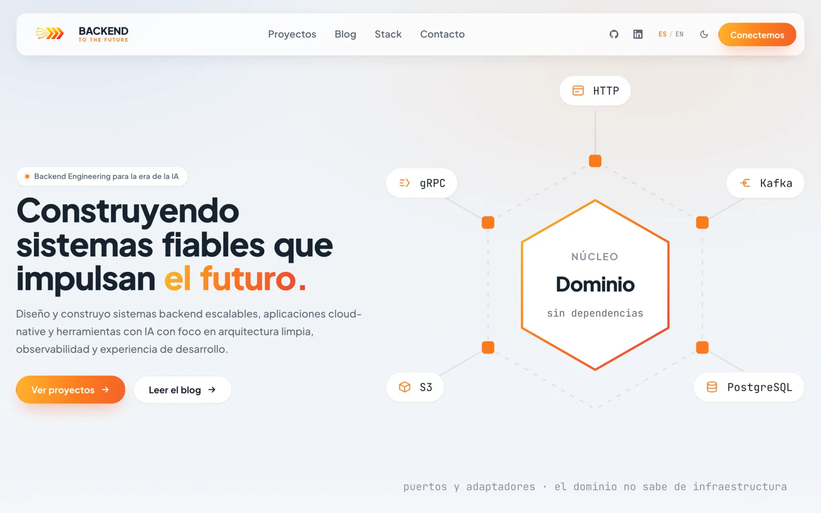
The screenshots are of the production sites on 13 September, with the analytics banner declined; they show the Spanish version. The social card is the one being served today; it will change as soon as this article is published, because it always shows the latest one.