
Green already meant weight
Week of 24–30 August: I finished Forma's dashboard, and when I went to align the colours of its charts I found that one component's default value had been asserting something false across four different screens for months.
Where the week started
Two things on the list. First, wire up automatic publishing of this recap to Mastodon and LinkedIn, so I can stop copy-pasting on Sunday nights. Second, finish Forma's dashboard — the last big screen that still had gaps in it.
The first went as planned and took Monday and Tuesday morning. The second took the rest of the week and turned into something else entirely.
Because the request, as I wrote it, was cosmetic: "the nutrition rings show calories in violet, protein in blue, carbs in green and fat in amber; make the dashboard charts match". Ten minutes of work, I thought. Four PRs later I was still pulling on the thread.
The knot
First layer: two screens contradicting each other
Before I even touched the charts, the first thing surfaced. The dashboard's nutrition widget and the Nutrition page were drawing the same macronutrients in different colours. On the dashboard, protein was green and carbs were amber. On the page, protein was blue and carbs were green. Both had been in production for months, both were "correct", and nobody had ever seen them side by side because they live on different routes.
The page's mapping won — it was already used on the meal labels. But that wasn't the problem. It was the symptom.
Second layer: the default value was an assertion
The component that draws every line chart in the app takes a color prop. And
if you don't pass one, it falls back to the brand accent. Green.
The catch is that green already meant WEIGHT. It meant it on the body composition cards and on the trend card's rows, which did pass their colour explicitly. So any chart written without thinking about colour came out green, and coming out green wasn't "coming out with no colour": it was saying weight.
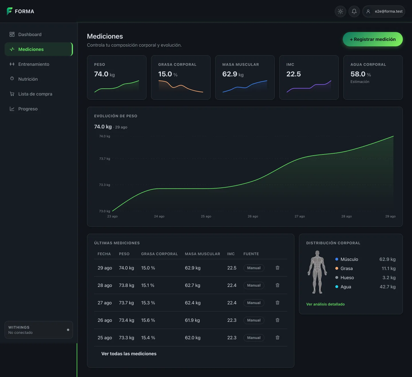
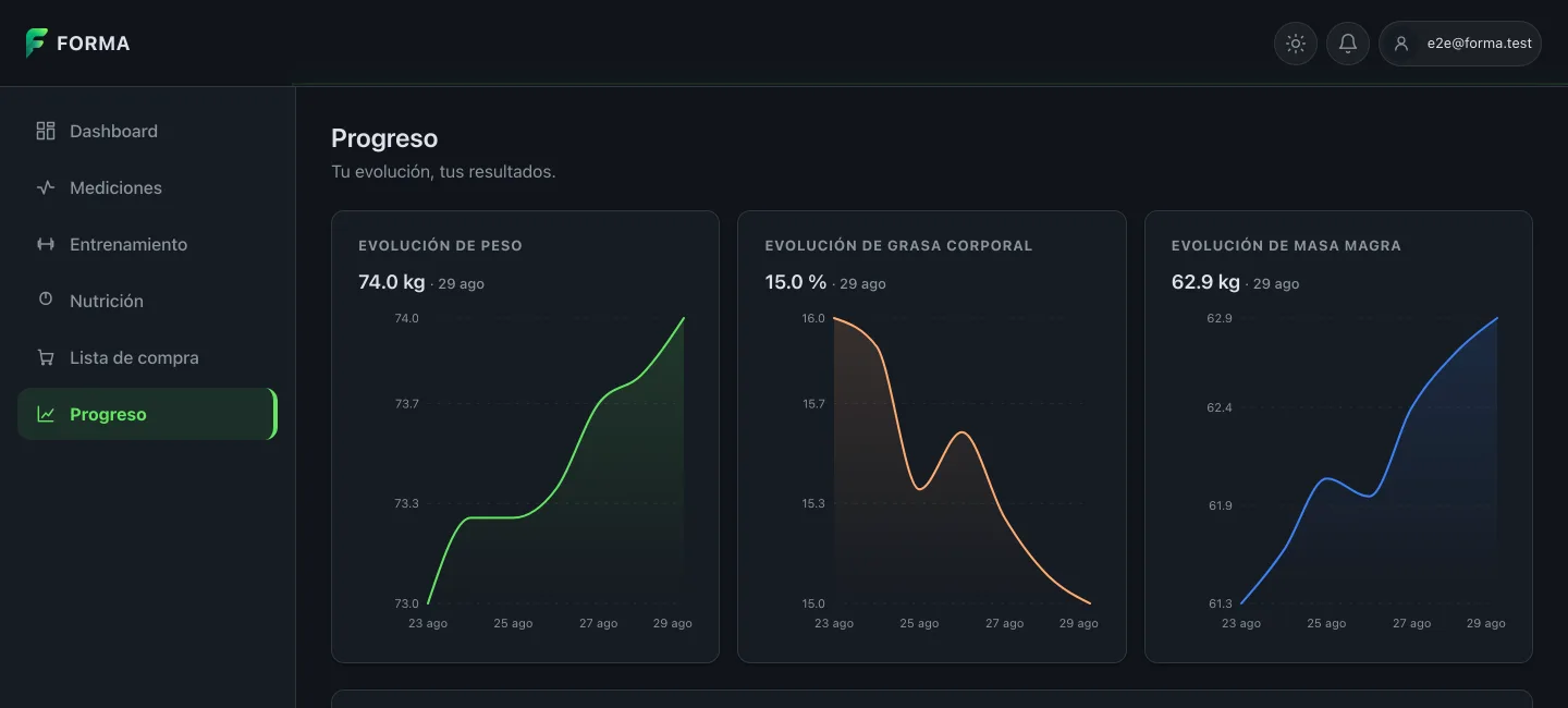
Four screens were saying it. The dashboard's Evolution card, where you pick the metric from a dropdown and the line stayed green whether you were looking at body fat or at muscle. The five charts on Measurements. The three cards on Progress. All asserting the same thing over different data.
Nobody wrote that bug. The default value wrote it.
Third layer: fixing it exposed a collision
Giving green back to Weight meant Muscle had to move to blue. And in the "Body composition" legend on the Measurements page, Water was already that blue. Two of four dots in the same colour tell the reader those two rows are the same thing.
This is where the problem stops being about style and becomes about accessibility, which is the one part of the week that earns a long explanation.
The obvious move was to shift Water to a cyan: a neighbouring hue, so the row still reads as water instead of becoming an arbitrary colour. But a blue and a cyan of the same brightness are exactly the pair that a colour vision deficiency flattens into indistinguishability. Hue is precisely what gets lost. Luminance isn't.
So the token isn't declared once but twice: #22d3ee in the dark theme and
#0e7490 in the light one. That's not just a concession to contrast against the
background — though it is that too. It's that the separation from Muscle's blue
had to be one of brightness: 2.04:1 in dark and 2.20:1 in light. A
difference in brightness survives any form of colour blindness, because
brightness doesn't depend on hue.
The alternative was to send Water back to grey, which is what that card's own documented rule suggests — colour for real values, grey for estimates. I dropped it so the legend keeps four legible marks instead of two colours and two greys.
And while I was in there, the numbers weren't written the same way
The same pattern showed up somewhere else. Measurements and Progress wrote
"74.0" with a dot. Nutrition, the plan generator and the dashboard cards went
through Intl in Spanish and wrote "74,0" with a comma. The trend card ended up
putting both separators on adjacent cards, which is exactly where you can see
this isn't a detail: it's the app contradicting itself ten pixels apart.
How it ended
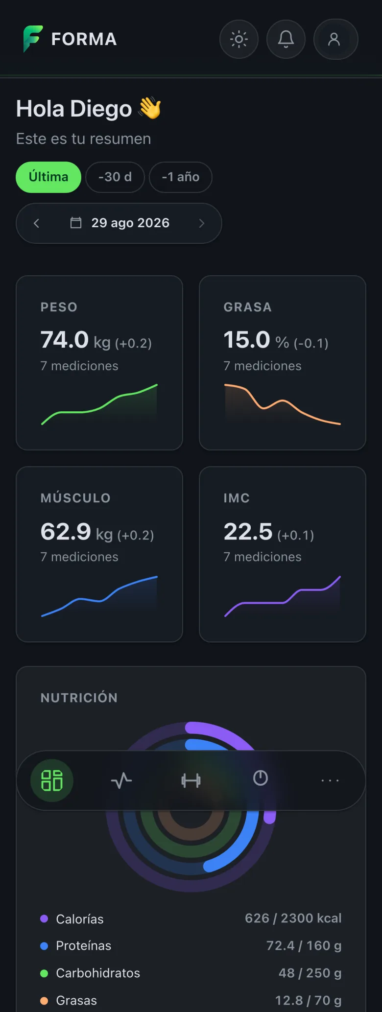
Colour stopped being decoration and became a contract: one metric, one hue, on every screen. Calories and BMI in violet, protein and muscle in blue, carbs and weight in green, fat in amber, water in cyan. Three PRs — one per screen — and a single source for the palette, with a test that breaks on purpose if anyone moves it.
In none of the three is colour the only carrier of the distinction: the selector names the metric, every chart carries its accessible label and every card its title. Colour adds; it doesn't replace.
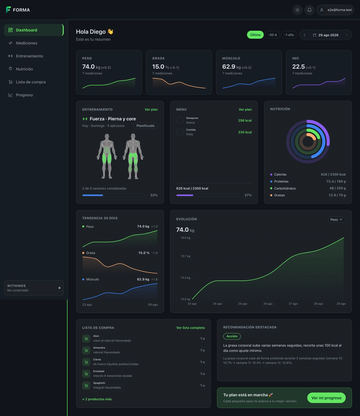
The nutrition card changed at the same time. It went from a calorie donut plus three macro bars to four concentric rings, in the shape of Apple Fitness's activity rings: calories are the outer ring, and protein, carbs and fat sit inside it. And the Nutrition page, which split the same information into two cards that could disagree with each other, now uses exactly the same block.
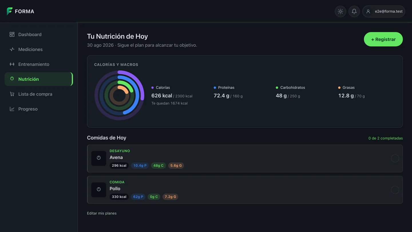
Two non-obvious decisions came out of drawing it. First: four rings and not
three, because calories are the day's headline number and the centre wasn't an
option — the hole measures about 24 pixels on the dashboard card, which fits
446 but doesn't fit / 2320 kcal. Second: the arc's rounded cap is switched
off when the value is zero. A round stroke-linecap at ratio zero paints a dot,
and that dot asserts a data point nobody logged.
On Measurements the change shows up across five charts at once, and the body composition legend is where the cyan lives:
And on Progress, the three cards that all used to say "weight":
The decimal separator was unified on the dot and, more importantly, centralised: there is now one module that decides how a number is written across the whole app. Four functions, because there are four distinct needs and mixing them was part of the mess.
The same batch added the change since the previous measurement, which now sits next to the value: "74.0 kg (+0.2)". It's rendered in muted ink on purpose, not in the series colour. A number in green or amber would say "good" or "bad", and losing weight is neither until someone decides what they're after. And since "(-0.5)" on its own means nothing read aloud, that form is hidden from the accessibility tree and replaced by a full sentence: "0.5 kg less than the previous measurement".
The last piece of the dashboard was the date navigator. It used to be two arrows: with nine hundred measurements, reaching the one from a year ago was nine hundred clicks. The same bar now offers three granularities — quick jumps, the system calendar and the same two arrows — and it navigates the dates that have a measurement, not the calendar: neither the jumps nor the calendar land on an exact date, they land on the nearest measurement. The jumps are also relative to what you're looking at rather than to today, which is what lets you cover the history in strides instead of the button going inert after the second press.
One parallel story deserves a paragraph. On Tuesday afternoon production started returning 429s. The first hypothesis was that the app was asking for too much, and that was half true — there were duplicate requests, and fixing them brought the dashboard's opening burst from twelve requests down to eight — but the 429s kept coming. They were being issued by the nginx in front, with a single rate limiting zone shared between static files and the API. A dashboard that loads eight requests and a handful of assets was throttling itself. The lesson isn't about code but about method: single requests never trip a rate limiter. If the test isn't a burst, it isn't a test.
What I'm taking away
A default value is an assertion. "No colour" doesn't exist; "green" exists, and green already meant something. If a component can render without being told what it represents, sooner or later it will represent the wrong thing. And the bug won't show up in any review, because nobody wrote it.
Once colour becomes data, it inherits data's obligations: a single source, a test that breaks if someone moves it, contrast measured in both themes, and never being the only carrier of meaning.
To separate two neighbouring hues, move the brightness, not the hue. Hue is exactly what a colour vision deficiency flattens.
Two screens drawing the same thing are two opportunities to contradict each other. The dashboard and the Nutrition page had been disagreeing for months without anyone seeing them together, and a different decimal separator on adjacent cards is the same failure wearing different clothes.
And one about working with agents: always check that a new test fails BEFORE the fix. Twice this week I wrote a green test that proved nothing. One of them because I was measuring against fixtures where everything responds in the same instant, so two requests separated in time appeared to collapse into one: I called a duplicate request fixed while it was still duplicated. The human on the other side of the keyboard was right several times where I was wrong, and that's part of the method too.
Next week
The actual plan generator. The request has been persisted for two weeks now, but there's still nothing that builds a plan out of it. And publishing this very post to Mastodon and LinkedIn with the scripts I wrote on Monday, which so far have only been dry-run.
The week in numbers
| PRs merged in Forma | 19 (#248 → #266) |
| Project total | 258 PRs |
| Lines in Forma | +9,961 / −3,199 |
| Database migrations | 0 — first 100 % frontend week |
| PRs in this blog | 5 (#28 → #32) · +935 / −38 |
| Claude Code working sessions | 11 |
| 5-hour windows consumed | 14 |
| Weekly window | not exhausted |
| My own prompts | 149 |
| Skills used | branch-pr, work-unit-commits, design, dataviz |
A note on the screenshots: they were taken against the app at the last commit of the week, with sample data and no real backend. None of what you see here is my actual health data.