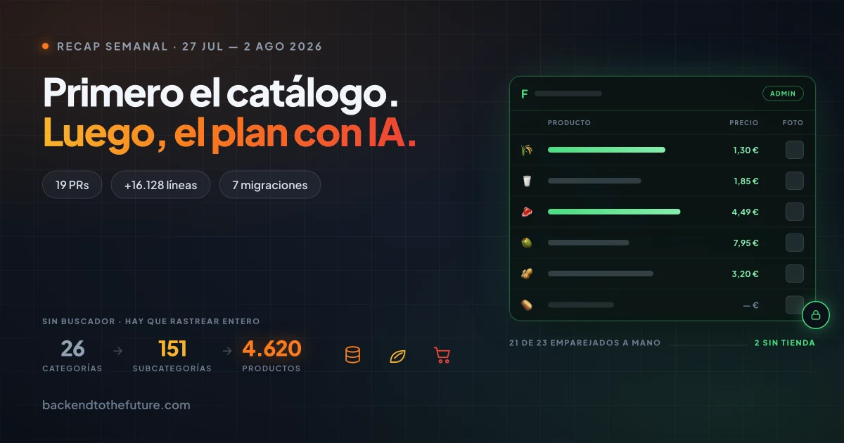
The Catalogs an AI Nutrition Plan Needs: The Plumbing Week Before the Magic
Week of July 27 – August 2: 19 PRs on Forma. I closed out the Withings integration, polished the cards and data tables, and built the global catalogs of macros and store products. None of it is visible. All of it is what makes generating a plan possible next week.
The week in one sentence
This week I didn't write a single line of the feature anyone actually cares about.
I wrote the vocabulary that feature is going to be written in.
Forma has to generate nutrition and training plans. That's the shiny part, it's what goes on the front page, and it's what I start next week. But a nutrition plan needs to know two things that until Friday didn't exist as editable data: what a food is worth nutritionally and where you buy it, in what format, at what price.
Both lived in a spreadsheet and in constants inside the frontend bundle. Changing a category's emoji required a deploy.
So that's what the week was: plumbing. And I think it's the most useful post I've written in this series, because plumbing is exactly the part people skip when they build with AI — and then wonder why the model generates plans that don't hold up.
The numbers
| PRs merged | 19 (project total: 183) |
| Lines | +16,128 / −3,571 |
| Database migrations | 7 (V35 → V41) |
| My prompts | 112 |
| Claude messages | 2,721 |
| Working windows | 17, spread across all 7 days |
| Context tokens | 1,170 M (of which 1,140 M are cache reads) |
| Output tokens | 1.87 M |
The number I care about there is the last block. Last week I burned through the weekly quota on Friday afternoon. This week came in with no scares at a similar volume of work, and it isn't because I optimized anything: it's because seven CRUD PRs on a data model that's already been thought through cost vastly less than seven stories with a full spec cycle in front of them. Cost isn't driven by how much code comes out. It's driven by how much has to be decided.
Withings: closed out
The Withings integration — OAuth, encrypted tokens, body measurement sync — landed the week before. This week it works, which is not the same thing.
It was failing in production in the worst way something can fail.
buildAuthorizationUrl generated a perfectly well-formed URL with an empty
client_id= when the credential wasn't configured. And that URL is followed by
the browser, not by the backend. So it never failed anywhere I could see: the
user went to Withings, signed in, picked their account, and only then hit this,
on a domain that isn't mine:
Missing client_id or scope in the request parameters
A dead end three steps away from the real failure, with nothing pointing back at my application's configuration.
The rule I took from this, and I think it holds for any OAuth integration: a redirect URL is a call you can't observe. Every other entry point in the adapter — the token exchange, the refresh — failed correctly, because they make an HTTP request and that request returns an error. The one that calls nobody was the one that broke silently. The class javadoc claimed this was already covered: that was true for two of the three methods.
Now every entry point checks its credentials first and throws an exception
naming the missing variable, so it reads inside the application: "The Withings
connection isn't configured in this environment (WITHINGS_CLIENT_ID is
missing)". The message reveals that a variable is undefined — never any
value.
A second classic fell out of the same PR: the Withings card in the sidebar said "Connected" always. It was hand-written text from before an integrations backend existed, and nobody revisited it. Now it reads real status — and while that status is unknown, the card doesn't render at all. A status indicator that can't read status is worse than an absent one.
The interface: cards, tables, and a state nobody designs
The first half of the week was polishing what was already shipped, and all of it came out of using the app on a real phone.
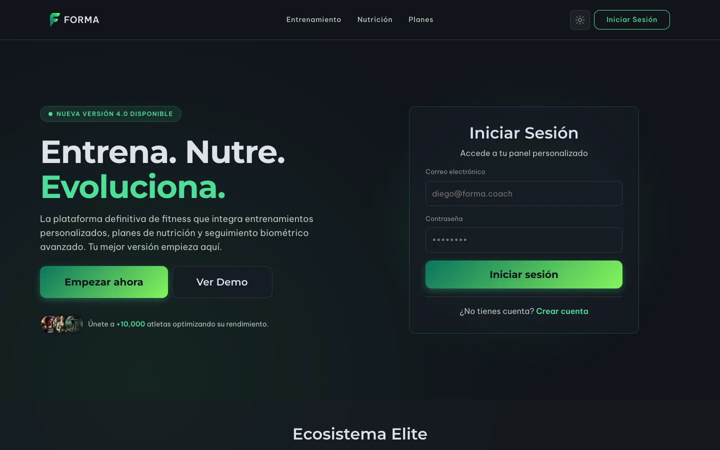
That's the public landing, the front door for anyone who has never been in. The hero CTAs stopped spanning the full width on mobile, which was this week's small fix on this screen.
And this is the dashboard you land on afterwards:
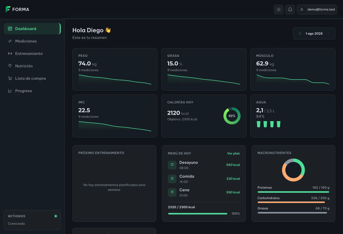
Two vertical scrollbars. Cards spilling out of their column. A breakpoint that
held two columns all the way to 574 px when it should have collapsed long
before. The "More" menu in the bottom bar missing the glass effect every other
menu had. Dashboard charts with body fat painted on the warning token, which
reads as "fat is a warning".
None of that is interesting on its own. What's interesting is two things that came out along the way.
The empty state is the real state
The fixes came from an account with body measurements but no nutrition or training plan yet — which is to say, the exact state of anyone who signs up. And that state was undesigned.
The "Calories today" card rendered 2120 kcal / Target: 0 kcal / 0%: three
numbers that mean nothing together. "Macronutrients" flat out did return null,
which left the card empty and sent its own title to the middle — because the
container gives leftover height to its last child, and with no content that
child was the header.
The empty state isn't an edge case. It's the first state everyone sees, and it's the only one visible 100% of the time before the product does anything for you.
The tests that can't see
All three layout bugs arrived by hand, and one of them twice. I had 674 Vitest tests green while the app had two scrollbars.
That's not a coverage failure. jsdom doesn't do layout: every element measures 0×0. A jsdom suite cannot detect a card overflowing its column, a second scroller appearing, or a fill that was supposed to be translucent painting opaque. It is structurally blind to that entire class of bug, no matter how many tests you add.
So I stood up five layout checks with Playwright against a real browser: no horizontal overflow, a single scroller, glass actually active, the mobile grid aligned, and cards sharing a row sharing a height.
And here's the part I care about: every check was verified by reverting the
bug it's meant to catch. I restored the viewport-height frame and the scroller
check failed on six routes, naming the culprit. I moved the glass @supports
block above the menu and the check failed with:
[role="menu"] is painted opaque (rgb(22, 27, 34))
A test you've never watched fail isn't a test. It's an unverified claim written in a test's syntax.
The widths aren't round numbers by accident either: 574 px is exactly where the grid was still two columns when it should have collapsed. The check is anchored to the bug, not to a pretty number.
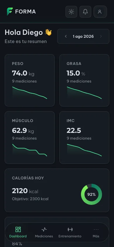
That floating bottom bar is the one that spent half a week with no glass effect
on its "More" menu. Now there's a check standing in front of anyone who moves
the @supports block again.
The catalogs: the real work
Which brings us to the second half — seven PRs and seven migrations.
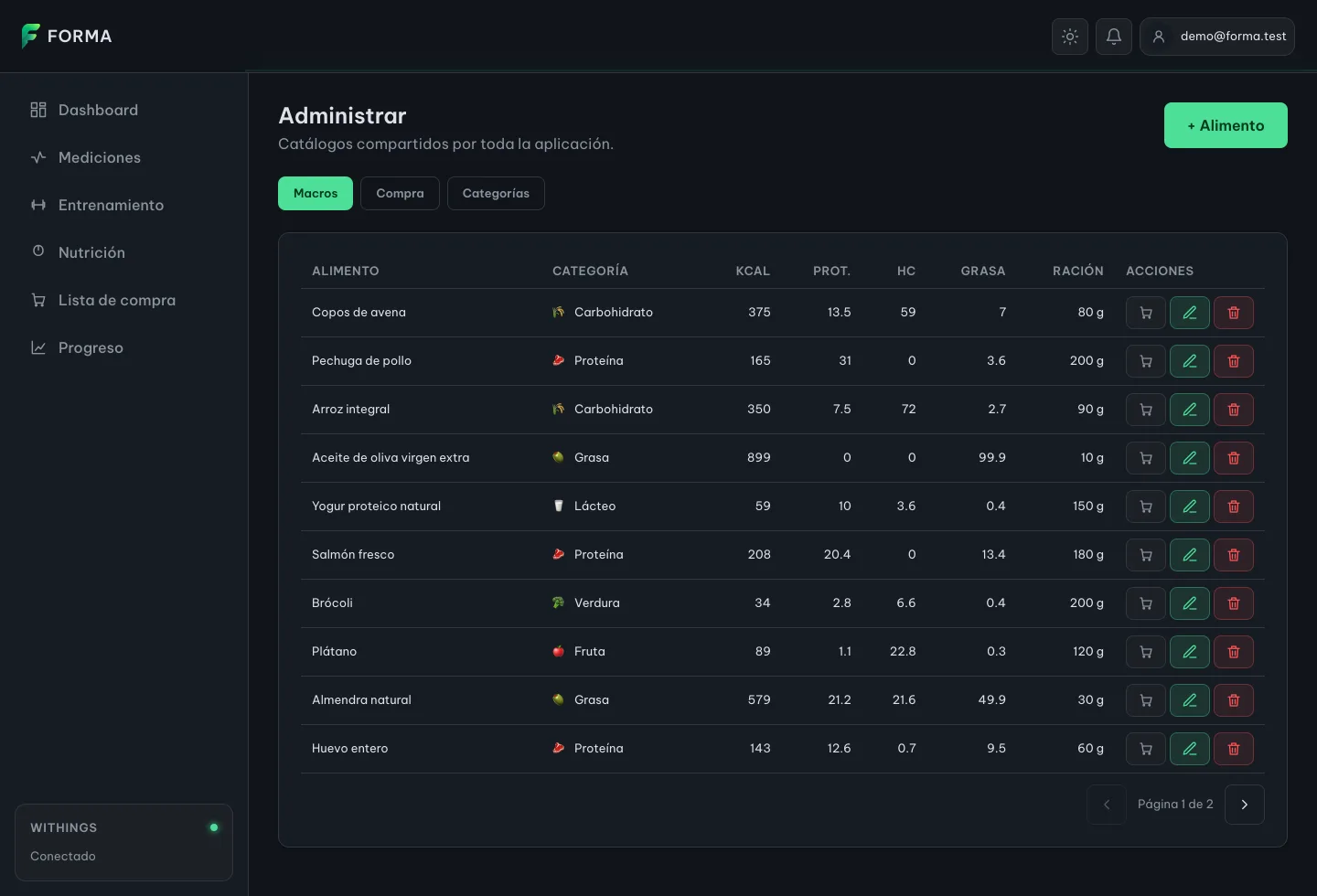
That screen is the week's output: the food catalog, editable without a deploy, with macros per 100 g and the suggested serving as its own column. Note where the glyph sits — in the Category column, not in front of the name. In front of the name it read as that row's icon, and every carbohydrate carried the same ear of wheat.
The model, which is the whole decision
| Table | Answers | Scope |
|---|---|---|
food_catalog |
what a food is worth nutritionally | global |
store_product |
where you buy it, in what format, at what price | global (new) |
shopping_products |
what this account buys this week | per user |
Three decisions that took far longer to think through than to write:
One table with a store column, not one table per chain. A product's
columns are identical at any supermarket. Adding Carrefour is an enum value and
a CHECK edit; a table per chain would duplicate the schema and every query,
forever.
The format price is not the weekly cost. An old migration stored the prorated cost — 0.15 bottles of oil — in the price field. That's a property of one person's plan, not of the product, so it doesn't travel to the shared catalog. Both numbers are euros, which is exactly why the mistake is easy; they are euros answering different questions.
The category table is not a list of categories. The set stays closed, in the
domain enums and in the CHECK constraints of three migrations. The new table
only says how each member reads: its label and its glyph. The consequence is
that the tab edits but doesn't create or delete — a category created there
couldn't be filed against anything, because the CHECK would reject it, and a
deleted one would leave the rows using it with nothing to render.
An action that always fails is worse than not offering the action.
And the admin role: there's no "first user is admin" magic. Promoting an
account is a deliberate UPDATE in the database. It's less convenient and it
avoids creating an administrator by accident on the first deploy. What protects
the catalog is the security annotation on the backend; the route guard in the
frontend is a courtesy for anyone typing the URL, not a barrier.
Probing an API that doesn't want to be probed
Filling the catalog by hand is 23 products transcribed from a spreadsheet. Filling it for real means reading the store. So I went to Mercadona's API, and what I found changed the whole design:
| Finding | Consequence in the code |
|---|---|
There is no search endpoint. /api/products/?q=, /api/search/ and /api/products/search/ all 404. Their search runs on Algolia, with keys embedded in their frontend |
You have to crawl the whole thing: 26 categories → 151 subcategories → 4,620 products. Snapshot cached for 24 h, once a day rather than once per question |
| The nutrition info carries no macros, only allergens and free-text ingredients | This fills the store catalog. The macro catalog stays hand-curated, and the product ↔ food link stays a human judgment |
| It does carry EAN, brand, origin and package format | The format is composed as "Jug 5 l": the container alone doesn't say how much is in it |
The important part is that this is not a public API. It's their store's: undocumented, unversioned, and free to change or refuse whenever it likes. The adapter is written to that reality, and the three rules explain themselves:
- A subcategory that fails gets skipped. One shelf out of 151 isn't worth killing the whole crawl; the opposite would make every import depend on the least reliable corner of their API.
- The index failing is fatal. With no categories there's nothing to crawl, and answering with an empty list would say "Mercadona sells nothing" — a lie wearing the face of an answer.
- Failures surface as a provider error, the same treatment Withings already had, so the screen offers "retry" instead of claiming the food doesn't exist.
It's a convenience for filling my catalog, never a dependency. If Mercadona stops responding tomorrow, the catalog and the shopping list keep working exactly the same.
One detail I nearly missed: the import endpoint is admin-only even though it only reads. Without that, anyone with an account could make my server crawl a third party's website. A read-only endpoint that goes out to the internet is not a read-only endpoint.
Suggest, never import on its own
Mercadona knows what a product is called, what format it comes in and what it costs. It does not know which food it is or which of my six sections it belongs to — and those two fields are precisely what make a row useful. So the screen proposes candidates and the admin picks. An imported product ends up indistinguishable from a hand-typed one, because it has to be.
The matching is deliberately crude: normalize, drop the words every Spanish
label carries (de, con, sin…) and keep whatever shares a meaningful word.
Without the stop-word filter, "Olive oil" matches half the store. It's a
filter over thousands of SKUs, not a decision: a wrong suggestion costs a
glance, and a missing one costs the manual entry you were going to do anyway.
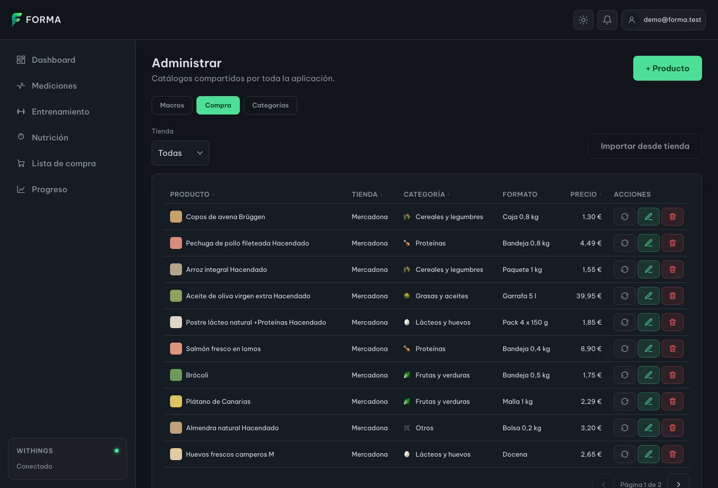
There's the store as a column, which was the underlying decision: Carrefour will be new rows, not a new tab. And the thumbnail takes the slot the glyph occupies in Macros, because here it really is that product's photo rather than a second reading of its category.
Of the 23 seeded products, 21 matched by hand against the real catalog — the
oats cost €1.30 and the spreadsheet said €1.55. The two left loose, whey protein
and sweet potato, are loose because Mercadona doesn't sell them. For those, an
OTHER store came in: a value in the set, not a nullable column. With NULL
meaning "no store", "All" and "No store" would be two different questions
answered by the same absence.
Lowlights
A form that silently dropped data. The product form built the object to save field by field from its own state — and the store id and the image URL are not its fields, because the form doesn't show them. So it discarded them. Every imported product was saved with no origin and no photo: meaning, with no way to ever refresh it. A form that constructs the object instead of starting from the draft loses everything it doesn't render. Those are provenance, not edits.
I lost a PR by merging with --delete-branch. It was stacked on another
one; deleting the base branch made GitHub close it instead of retargeting it to
main. It had to be redone, rebased, same content, new number. The two stacked
PRs that came after carry the warning written in the body. Chained PRs are the
right way to keep reviews small, but they have their own ergonomics and you
learn them by paying.
A CSS token nobody had declared. Recoloring the dashboard series turned up
that --color-info didn't exist. Two stylesheets were writing
var(--color-info, #3b82f6): a reference to a nonexistent token, so both
silently used the fallback, and the light theme was left with a blue chosen for
a dark background, below the contrast a chart line needs. The var() fallback
is convenient and that's exactly why it's dangerous: it turns a missing token
into a plausible value instead of into an error.
Buttons that had been props for three months. The 7D / 30D / All selectors
on the evolution widget were inert <span>s under aria-hidden, justified with
"no endpoint accepts a date range". The range never needed an endpoint: the
full history was already in memory, and another screen in the same project had
been filtering it client-side for weeks. An unverified assumption became a
comment, and the comment became a justification.
The thread
I retired a feature this week. Goals came out of the application: −1,728 lines of frontend, keeping the backend, the tables and the stored data, so that reverting means restoring one menu entry and one route.
But before deleting, I traced who consumed it — and that's when it surfaced that two achievements in the catalog, "first goal created" and "first goal achieved", are not visible: the endpoint exists, and no frontend file calls it. Backend code in production, with tests, that nobody has ever executed from the app.
That's the thread of the week, and it connects all three halves. The integration that looked finished failed on the one path nobody observed. The green tests were blind to an entire class of bug. The chart buttons were decorative. The achievements have no screen. The catalog lived in a spreadsheet.
None of it is visible, and all of it decides whether the visible part is worth anything.
Which is why the plumbing week matters more than it looks when you build with agents: an agent writes the shiny feature as fast as you can ask for it. What it can't do for you is decide that the format price and the weekly cost are two different numbers, or that the category table must not allow creating categories. Those decisions are the product. The code is the consequence.
Next week
Generating the nutrition plan and the training plan. Finally the shiny part.
With one difference from how I'd have started a month ago: the plan will now be written on top of a vocabulary that exists, that's editable without a deploy, and that's matched to real products in a real store at real prices.
If the catalog lies about what a food is worth or where you buy it, the generated plan inherits the lie and presents it with total confidence. That's the failure I wanted to make impossible before writing the first line of the generator.